
Financial Services / Direct Mail / Print Production / CRM
Bank mail is a category built on sameness: a big rate, a wall of disclosures, a reply-by date. PNC needed its mail to feel like the rest of the brand, and to work as a system that could carry each customer’s own offer without being redesigned every time.
Took the Brilliantly Boring platform and the design system already running across PNC’s digital channels and built it into print. The brand’s arcs and half circles became the structure of each piece, giving offers, benefits and required legal copy each a clear place. Every layout was designed around variable fields, so one printed shell could carry each customer’s name, card, rates and dates, keeping every version on brand while production stayed efficient.
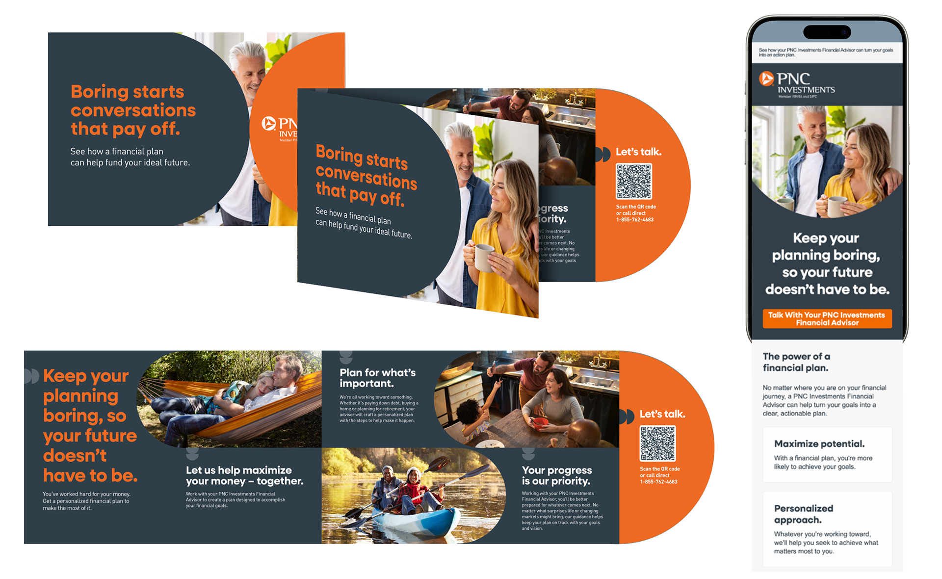
PNC Investments, Planning
Invited clients to start the year with a financial plan. A die-cut half circle carries the brand’s shape into the fold, and the email picks up the same headline and image so the message is recognizable wherever it lands first.
Invited clients to start the year with a financial plan. A die-cut half circle carries the brand’s shape into the fold, and the email picks up the same headline and image so the message is recognizable wherever it lands first.
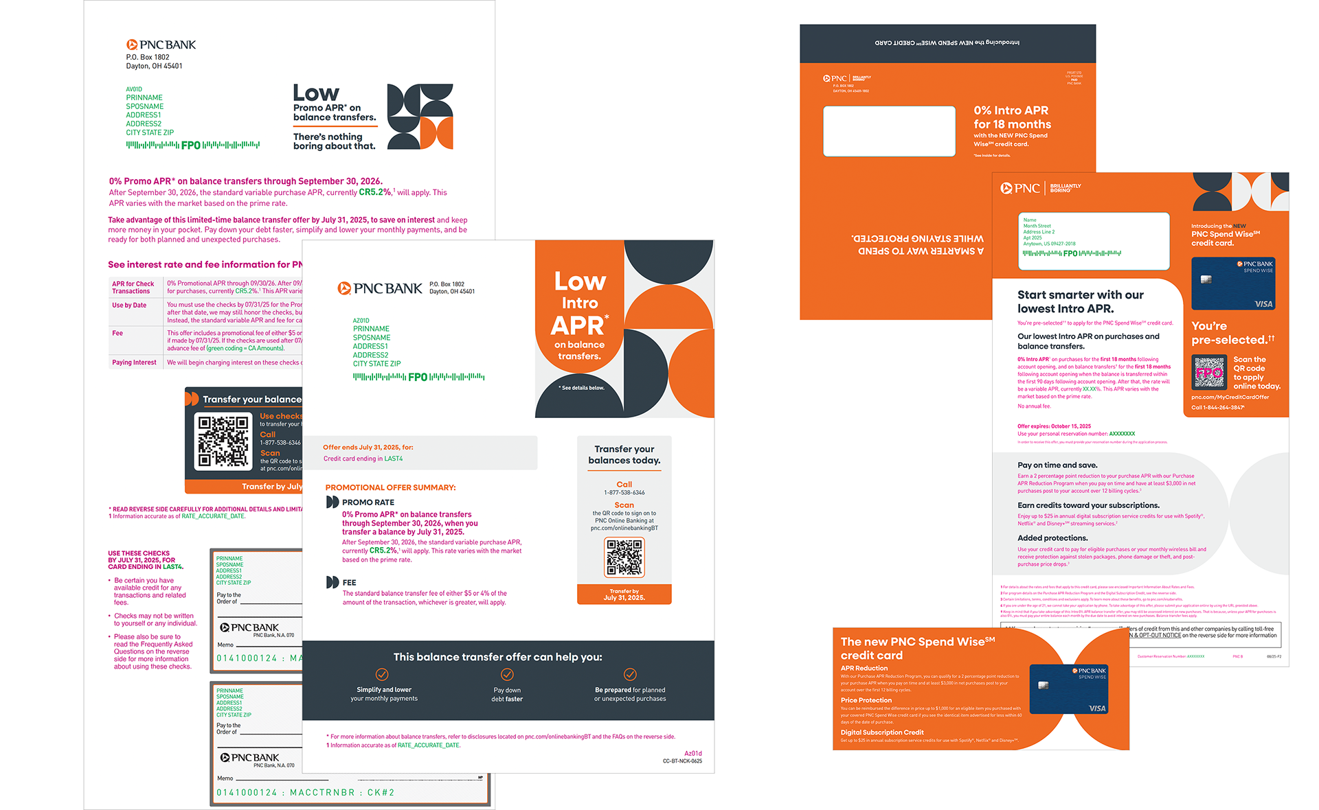
Credit Cards
Designed the balance transfer offer as twelve versions across two builds, eight with perforated convenience checks and four without, printed as two-color shells with each customer’s terms and account details imaged in. Introduced the new Spend Wise card to pre-selected prospects with a personalized letter and a QR code leading straight to the application.
Designed the balance transfer offer as twelve versions across two builds, eight with perforated convenience checks and four without, printed as two-color shells with each customer’s terms and account details imaged in. Introduced the new Spend Wise card to pre-selected prospects with a personalized letter and a QR code leading straight to the application.

Home Equity
Turned a choice between two products into a simple side-by-side. On paper it works as a checklist; on the phone it becomes a comparison table. Mail and email were designed together from the same system, so a customer saw one PNC whether the offer arrived in the inbox or the mailbox.
Turned a choice between two products into a simple side-by-side. On paper it works as a checklist; on the phone it becomes a comparison table. Mail and email were designed together from the same system, so a customer saw one PNC whether the offer arrived in the inbox or the mailbox.